To-Do List App - Part 4
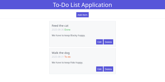
We will have a very brief look at how HTML and CSS work together, although we’ll quickly move on to an existing framework to save ourselves a lot of work. For experimenting with HTML/CSS we will create a few files that we don’t need in our project. You can switch to another folder or delete the files afterwards.
Create a simple HTML file test.html with the following content:
<!DOCTYPE html>
<html lang="en">
  <head>
    <link rel="stylesheet" href="style.css">
  </head>
  <body>
    <h1>Test CSS</h1>
    <p>This is an example page.</p>
  </body>
</html>
This is almost the same as the basic template from the previous part.
This time we do include a file style.css, so create that file as well
with the following lines:
h1 {
  color: red;
  text-align: center;
}
If you now open test.html, the h1 header that previously used the default
browser styling is now red and centred. In our css code we have a rule that
starts with a selector, in this case ‘h1’. That means that the changes inside
the curly braces will be applied to all h1 tags. By adding more rules, we can
make our page look however we want. Also, we only need to change the rules
for our h1 tag in one place to change for example the colour of all our h1
headers.
But what if we want to apply a change only in a few places? Let’s add another paragraph, so our html body looks like this:
<h1>Test CSS</h1>
<p>This is an example page.</p>
<p>Here we have an important paragraph.</p>
Suppose we want to make the important paragraph stand out. If we add a rule
for the p-tag, all paragraphs will change. The solution is to use a class.
Instead of a tag selector like the ‘h1’, we add a class selector. We can
name it whatever we want, but we put a dot in front to mark it as a class.
Add the following rule to style.css:
.special {
    color: green;
    font-weight: bold;
}
These changes will be applied to all elements that have our new ‘special’ class. We can use the class in our HTML by adding it as a class parameter. Change the last paragraph by adding the class to the p-tag:
<p class="special">Here we have an important paragraph.</p>
If you open (or reload) test.html, only this last paragraph will be green and
bold.
Finally, how can we apply our ‘special’ styling to a single word? We have to
use our class in a tag, so we need to wrap that word in a tag. So far our tags
had some meaning: h1 for header, p for paragraph. There are also two more generic tags that
we can use for styling: div and span. The div tag marks a section or block. Without
any styling it behaves a little like a paragraph, but you can wrap a block of
text inside div tags to apply styling to that block. We will be using that later
in our app. The span tag is similar, but is used inline. So if we just want to
change a single word inside a line, we wrap it in a span tag. We can then apply
our styling to that span:
<p>A line with an <span class="special">important</span> word.</p>
There are many types of selectors, for example with p.special the rule only
applies to paragraphs with the ‘special’ class. There are also a lot of rules
you can apply. If you want to know more, try one of the many css tutorials.
For our app we will not be writing our own rules. Instead we’ll use an existing
css framework.
Using a CSS framework #
Instead of starting from scratch, we can use a css framework. For example, many websites use Bootstrap . This css library provides ready to use css for components like buttons, navigation bars, and tables. It also provides containers for layout, for example to put page elements in columns. This makes it also easy to create responsive websites, where the layout changes depending on screen size. For example, on a computer screen you can have three images next to each other, but on a phone they would get too small. With a responsive design, the images will only be shown next to each other when the screen is large enough, otherwise they will each have their own row.
You can try this out on a pc, by dragging the side of your browser window to make it smaller. On most websites, you’ll notice page elements jumping around once they don’t fit inside the browser window any longer.
Instead of Bootstrap we will be using a much simpler framework: Spectre CSS . It doesn’t have all the features of Bootstrap, but it’s sufficient for our app.
Let’s create a test page for our to-do list and apply some Spectre styling. Instead of using our Jinja template, I find it easier to make an html page with some hardcoded text first. Once we’ve added the styling, we will update the Jinja template.
First, we need to include the Spectre CSS. According to the
installation
documentation we can download the css file so we can add it to
our project, but we can also get it from a
CDN
.
After a quick look at the docs I don’t think we need the experimentals
and the icons, so we only need to include spectre.min.css.
Let’s start with the following file todotest.html:
<!DOCTYPE html>
<html lang="en">
  <head>
    <meta charset="utf-8">
    <title>To-do list</title>
    <link rel="stylesheet" href="https://unpkg.com/spectre.css/dist/spectre.min.css">
  </head>
  <body>
    <h1>To-Do List Application</h1>
    <p>Content</p>
  </body>
</html>
This is our standard html template from the previous part with the Spectre
stylesheet included. Note that instead of style.css which loads the our
own css, we now have the url of the CDN. We don’t have to download anything.
If we open the html file, the browser will retrieve spectre.min.css from
the given url. The entire stylesheet line is just copied from the Spectre
installation docs.
Even without specific styling, the page already looks different because the default Spectre styles are applied now. Have a quick look through the sections of the documentation to see what’s available. Let’s start with the title.
We already have some styling for h1, which you can find in the docs under
Elements - Typography. Let’s try to centre the title and add some colour.
Under ‘Utilities - Text’ it says that we can centre a block
with <div class="text-center"></div>. Instead of wrapping the h1
in this div, we can also simply add the class to our h1:
<h1 class="text-center">To-Do List Application</h1>
Under Utilities - Colors we can find the classes for applying colour.
We have to select our colours from a few options. That’s a bit limiting,
but it also prevents us from making a mess by picking whatever we want.
(If you really do want other colours, you can make a custom version of
Spectre, or add some styling by also loading your own css file).
Let’s try the bg-primary background. We can add multiple classes
by separating them with spaces:
<h1 class="text-center bg-primary">To-Do List Application</h1>
The text colour is already white now, but it’s a little close to the blue box. Let’s also add some vertical padding (Utilities - Position):
<h1 class="text-center bg-primary py-2">To-Do List Application</h1>
There’s also my-2 for margin. That will also add some space, but
it will put the margin outside the blue background. Try it out and
see the difference. Since we want space between the text and the border
of the box, we want padding here.
In our app we need a button to add a new to-do item, so let’s add a button for that. Let’s use the blue one from Element - Buttons:
<h1 class="text-center bg-primary py-2">To-Do List Application</h1>
<button class="btn btn-primary">Add item</button>
We need to centre the button, but the text is already centred
inside the button. Instead of text-center, we need p-centered
(see Utilities - Position), so add that to the button class.
Under Utilities you can also find a divider, so we can separate
the title and button from the list of items:
<h1 class="text-center bg-primary py-2">To-Do List Application</h1>
<button class="btn btn-primary p-centered">Add item</button>
<div class="divider"></div>
If you look at the Components of Spectre, maybe we can use the Cards for our to-do items. The complete card code from the documentation looks like this:
<div class="card">
  <div class="card-image">
    <img src="img/osx-el-capitan.jpg" class="img-responsive">
  </div>
  <div class="card-header">
    <div class="card-title h5">...</div>
    <div class="card-subtitle text-gray">...</div>
  </div>
  <div class="card-body">
    ...
  </div>
  <div class="card-footer">
    <button class="btn btn-primary">...</button>
  </div>
</div>
Note how the example used div tags to mark sections and enables us to add classes to these sections.
We don’t need the image. The title can be in the card title, and the description in the card body. Maybe we can put the date and status in the subtitle. The example footer already has a button, so let’s use that for buttons for editing or deleting the item. Fill in some dummy data and add a card after the divider:
<div class="card">
  <div class="card-header">
    <div class="card-title h5">Feed the cat</div>
    <div class="card-subtitle text-gray">2025-08-30 Done</div>
  </div>
  <div class="card-body">
    We have to keep Blacky happy.
  </div>
  <div class="card-footer">
    <button class="btn btn-primary">Edit</button>
    <button class="btn btn-primary">Delete</button>
  </div>
</div>
You can copy and paste this card so you have a few cards in
your todotest.html. I’ve put the ‘Done’ status after the date
for now, but perhaps we can also change the styling depending on
the status. By having more than one card, you can experiment
and compare.
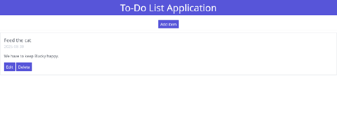
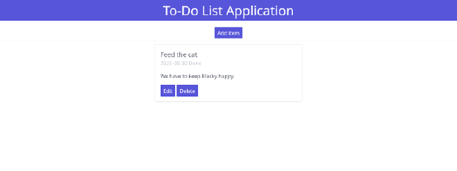
I don’t like the card text to be all the way to the left on a large screen. We could centre everything, but have a look at the Spectre docs for Layout - Flexbox grid. Spectre provides a responsive (we’ll get to that) grid with 12 columns. We can try to divide the screen into 3 columns and put the cards in the middle one, leaving the other two empty. Each of our columns will be 4 Spectre-columns wide (3 times 4 equals 12). The documentation shows us we have to use something like this:
<div class="container">
  <div class="columns">
    <div class="column col-4">empty</div>
    <div class="column col-4">card</div>
    <div class="column col-4">empty</div>
  </div>
</div>
The col-4 uses 4 of the 12 columns, so one third of the total
width. Spectre puts a small gap between columns, which is fine. If
you don’t want gaps, you can use <div class="columns col-gapless">.
Note that we don’t need to wrap each card in a columns container.
We can just put all of our item cards in the middle col-4.
Replace the card (or cards) in your test file with something like
this (instead of ... paste your complete card contents here):
<div class="container">
  <div class="columns">
    <div class="column col-4"></div>
    <div class="column col-4">
      <div class="card">
        ...
      </div>
      <div class="card">
        ...
      </div>
    </div>
    <div class="column col-4"></div>
  </div>
</div>
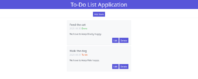
We’re almost there. Try out some Spectre styles and make
your own changes. I’ve added a background colour to the
card and some vertical margin to create a little space between
the cards (<div class="card bg-gray my-2">), wrapped the
‘Done’ and ‘To-do’ in a span in order to apply text colours
(text-success and text-error), and wrapped the buttons
in a div to align them to the right with float-right (see
Spectre Utilities - Position). I think that’s good enough
for now. Maybe we will make some changes later when we start
working on the app itself. For example, we do have an edit
button, but it would be nice if we could just change a to-do
item to ‘done’ without having to switch to an edit view. Maybe
we’ll add a ‘Done’ button to items with To-do status later.
There’s one more problem. Try to shrink your browser window (make sure your browser isn’t full-screen and drag the right border of the browser window to the left). We have the cards taking up the middle third of the screen. This looks fine on a monitor, but as the screen gets smaller (as it will be on phones), the cards should take up more space.
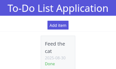
Remember we mentioned responsive? If you look at the Spectre docs
for Layout - Responsive, you can set the columns depending on the
screen size. For example, the smallest size is xs for screens
with a width of 480px or below. On tiny screens, maybe we still want
a margin next to our cards, but it shouldn’t take up one third of the
screen. Maybe we could divide the 12-column layout into 1 margin left
and right, leaving 10 for the card. For larger screens we keep our
current layout, so we keep our col-4 but also add col-xs-* to
specify the layout once we shrink to 480px.
<div class="container">
  <div class="columns">
    <div class="column col-4 col-xs-1">empty</div>
    <div class="column col-4 col-xs-10">card</div>
    <div class="column col-4 col-xs-1">empty</div>
  </div>
</div>
It takes some experimenting with changing your browser window to find
out at which screensize you should change the layout and how many
columns to use. I decided to switch to 1-10-1 at md (840px). It’s
a big jump from 4-4-4 to 1-10-1, so I added another layout of 2-8-2
at xl. Now, if you shrink or expand your browser window, you should
see the card size jumping around as you pass the md or xl width. Here’s
the full code of our mockup:
<!DOCTYPE html>
<html lang="en">
  <head>
    <meta charset="utf-8">
    <title>To-do list</title>
    <link rel="stylesheet" href="https://unpkg.com/spectre.css/dist/spectre.min.css">
  </head>
  <body>
    <h1 class="text-center bg-primary py-2">To-Do List Application</h1>
    <button class="btn btn-primary p-centered">Add item</button>
    <div class="divider"></div>
    <div class="container">
      <div class="columns">
        <div class="column col-4 col-xl-2 col-md-1"></div>
        <div class="column col-4 col-xl-8 col-md-10">
          <div class="card bg-gray my-2">
            <div class="card-header">
              <div class="card-title h5">Feed the cat</div>
              <div class="card-subtitle text-gray">2025-08-30 <span class="text-success">Done</span></div>
            </div>
            <div class="card-body">
              We have to keep Blacky happy.
            </div>
            <div class="card-footer">
              <div class="float-right">
                <button class="btn btn-primary">Edit</button>
                <button class="btn btn-primary">Delete</button>
              </div>
            </div>
          </div>
          <div class="card bg-gray my-2">
            <div class="card-header">
              <div class="card-title h5">Walk the dog</div>
              <div class="card-subtitle text-gray">2025-08-31 <span class="text-error">To-do</span></div>
            </div>
            <div class="card-body">
              We have to keep Fido happy.
            </div>
            <div class="card-footer">
              <div class="float-right">
                <button class="btn btn-primary">Edit</button>
                <button class="btn btn-primary">Delete</button>
              </div>
            </div>
          </div>
        </div>
        <div class="column col-4 col-xl-2 col-md-1"></div>
      </div>
    </div>
  </body>
</html>
Try to make your own changes until you’re happy with the result. You could even try to apply this mockup to your Jinja template, which is what we will do in the next part.